What an AI agent website needs: pages and patterns
The pages and patterns an AI agent product site needs to earn trust: approval shown working, permissions, activity logs, hand-off, calculators and comparisons.
An AI agent website has a different job from an ordinary SaaS site: it has to convince a buyer to let software act on their behalf. That means showing approval before action working on the page, a permissions page that explains the rules, an activity log, a clear hand-off to humans, a calculator instead of claimed percentages, a real security page and an honest comparison with doing the work by hand or hiring someone. Features matter less than control.
A buyer evaluating a chat tool asks whether the answers are good. A buyer evaluating an agent asks what happens when it is wrong, who sees it first and how they stop it. Every pattern below exists to answer that second set of questions before the sales call, using examples from our AI agent website templates.
Show approval before action, working
The single most persuasive thing an agent site can do is let the visitor approve something. Not a screenshot of an approve button, but a working mock-up in the hero: a task arrives, the agent drafts a response, it waits, and the visitor clicks Approve or edits the draft before it goes out.
This does two things at once. It shows the output, which is what the product is for, and it shows the control, which is what the buyer worries about. A static image can show one of those. A working mock-up shows both and makes the visitor do the approving, which sticks.
Tidewell, our template for an AI inbox agent, leads with exactly this loop on its home page: visitors watch a reply arrive, see the draft and press Approve themselves. Foray, built for AI SDRs, shows its product as a working approval desk where the agent drafts an email, it waits, and the visitor approves or edits it before it sends.
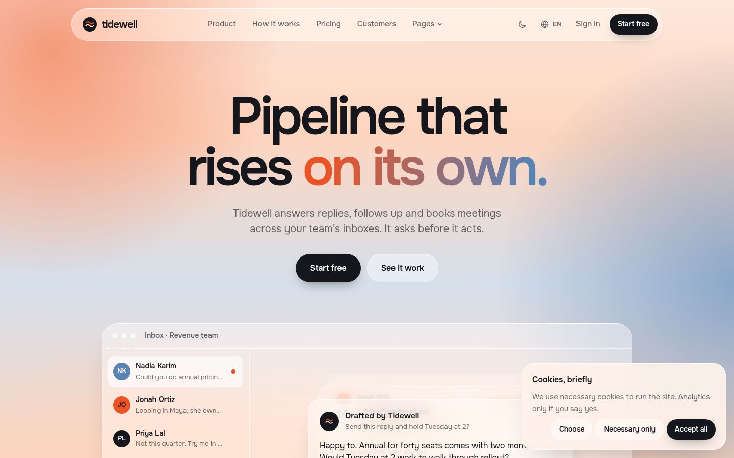
Patterns that make an approval mock-up convincing:
- The draft is specific to a believable task, with names, times and a real-sounding message.
- The waiting state is visible: the agent has stopped and is asking.
- Edit is as prominent as Approve, so control does not look like a formality.
- After approval, the next step completes (the email sends, the meeting books), so the visitor sees the full loop.
A permissions and rules page
Buyers want to know the boundaries in writing. A dedicated trust or permissions page should say what the agent may do on its own, what always needs a person, what it can never do and who can change those rules. Write it in plain sentences, not policy language.
The best version is interactive. Tidewell ships a trust and permissions page with a live rules editor: visitors can try the rules themselves rather than read a promise about them. If your product has role-based settings, show the roles. If it has spending or sending limits, show where they live.
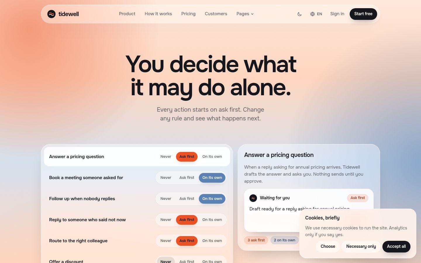
Keep the permissions page linked from the main navigation or footer, not buried in docs. It is a sales page for the most nervous person in the buying group.
An activity log
An agent that works while nobody is watching needs a record of what it did. Show that record on the marketing site. A short activity log, with timestamps, actions taken, items waiting for approval and anything the agent declined to do, answers the auditing question before security review asks it.
Tidewell includes an activity log among its working mock-ups, next to the inbox, approvals, permissions and calculator. The log does not need to be long. Five rows that read like a real morning are enough to make the point that nothing happens silently.
Hand-off to humans
Every agent hits cases it should not handle. The site should show what happens then: the agent recognises it is unsure, stops, and passes the work to a named person or queue with the context attached.
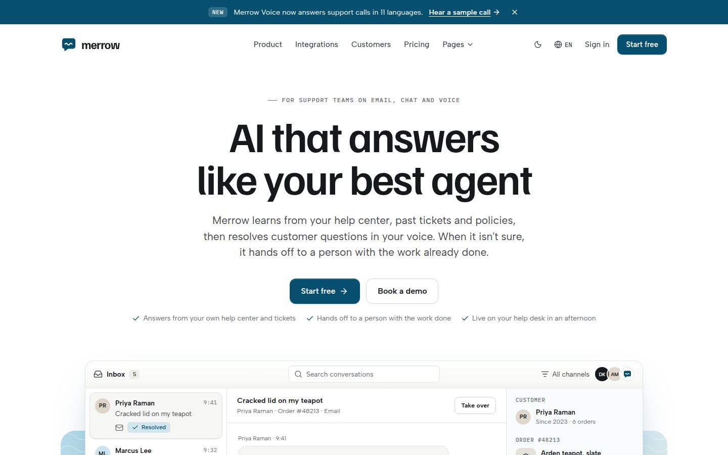
Merrow, our AI support assistant template, is built around this. Its copy says the assistant answers from the help centre, past tickets and policies, and hands the work over to the team when it is not sure, and its home page shows an inbox and a hand-off mock rather than abstract shapes. That is the right instinct for any agent: make the hand-off a feature you demonstrate, not an apology in the FAQ.
Calculators, not claimed percentages
Agent sites love a big number: hours saved, reply rates, pipeline added. Unsourced numbers make careful buyers trust the rest of the page less. A calculator works better. The visitor enters their own volume, their own time per task and their own costs, and the page does the arithmetic in front of them. The result is their number, so they believe it.
Two examples in our catalogue:
- Tidewell has a time-saved calculator page.
- Foray has an interactive ROI calculator.
Keep the formula visible or one click away, use conservative defaults, and never pre-fill the inputs with a best case. If your product has published results from a real customer, link the full story and say exactly what was measured.
Security, written for the reviewer
Once a champion likes the product, someone else reviews it. That person wants a security page with specifics: what data the agent can access, where it is stored, whether it is used for training, how access is revoked, what is logged, and how to reach the team with questions. Link it from the footer and from pricing.
Tidewell, Foray, Merrow and Relay each ship a security page. Treat the template copy as a structure to fill with your actual practices. Never publish a certification or compliance claim you do not hold.
Compare against doing it by hand or hiring
Agent buyers rarely compare you with a competitor first. They compare you with the status quo: doing the work themselves, or hiring a person. A comparison page that meets that thought head on is more useful than another feature grid.
- Tidewell includes an agent-versus-doing-it-yourself page.
- Foray includes an agent-versus-hiring-an-SDR comparison.
Be fair in these tables. Say where a person is better (judgement on unusual cases, relationships) and where the agent is better (speed, consistency, working through a queue at night). A one-sided comparison reads like an advert and gets skipped.
Developer-facing agent platforms
If your agent product is a platform that developers build on, the site needs a different first screen: code, not an inbox. Relay is built for that case, with a TypeScript and Python toggle that updates every code sample, an install line with copy buttons, an example-run player and an integrations and security section. Our developer tools website guide covers that side in depth.
The page list
Putting it together, an AI agent website should have at least:
| Page or pattern | What it proves |
|---|---|
| Home with a working approval mock-up | The output is good and a person stays in control |
| How it works | The steps the agent takes, in order |
| Trust and permissions | The rules, in writing, ideally editable |
| Activity log (on product or trust page) | Nothing happens silently |
| Hand-off section | What happens when the agent is unsure |
| Calculator | The value, in the visitor's own numbers |
| Security | Data access, storage, logging and revocation |
| Comparison with doing it by hand or hiring | Why change from the status quo |
| Pricing, integrations, customers, changelog | The usual SaaS essentials |
The remaining pages are the same as any complete SaaS site, which our 33-page checklist covers. For the copy itself, read writing a landing page for an AI product.
Note: The demo customers, people and results in our templates are fictional. Replace them with your own before launch, or remove the section until you have them.
If your agent drafts and sends on someone's behalf, Tidewell is the closest fit; for sales outreach, look at Foray.
Changelog
- 2026-10-05: first published