Swiss style web design: the grid, the type and how to build it
A short history of the International Typographic Style, its core principles, and how to translate the grid, type scale and asymmetry into modern CSS.
Swiss style web design applies the rules of the International Typographic Style to the browser: a visible or implied column grid, asymmetric layouts, a sans-serif typeface used in a few strong sizes, and text set flush left with a ragged right edge. On the web it maps almost directly onto CSS grid and a fixed type scale. It suits products that want to look clear, confident and precise rather than decorative.
It is one of the few historical design movements whose methods transfer to websites with almost no translation, because its whole point was a system that organises information. This guide covers where the style came from, the principles worth keeping, how to build them in CSS, and one template that uses them.
A short history of the International Typographic Style
The style developed in Switzerland in the 1950s, around the design schools of Basel and Zurich, and it is often summarised by its Wikipedia entry) as asymmetric layouts, a grid, sans-serif type and flush-left, ragged-right text. Teachers such as Emil Ruder, who taught typography in Basel from 1942 and later wrote the textbook Typographie (1967), shaped how a generation of designers worked.
Two events in the late 1950s gave it momentum. In 1957 the Haas foundry near Basel released Neue Haas Grotesk, drawn by Max Miedinger and later renamed Helvetica; the same year Adrian Frutiger's Univers appeared. And in 1958 Josef Müller-Brockmann, Hans Neuburg, Richard Paul Lohse and Carlo Vivarelli founded the journal Neue Grafik in Zurich. Its eighteen issues, published until 1965, spread the movement's ideas well beyond Switzerland, which is how a Swiss style came to be called international. Müller-Brockmann's later book, Grid Systems in Graphic Design, first published in 1981, is still the standard reference for designing with grids.
That is the whole history you need for the web. The interesting part is what the designers were trying to do: present information objectively, so the structure of the content is visible in the structure of the page.
The principles worth keeping
Not everything from 1950s posters belongs on a product site. These do.
- **A grid that decides things.** Columns and rows are not a background decoration; they decide where every element starts and stops. Two items aligned to the same column line look related even when they are far apart.
- **Asymmetry.** Content hangs from the left edge of a column rather than being centred in the page. The empty space on the right is part of the composition, not leftover.
- **Sans-serif type in few sizes.** One family, a handful of sizes with big jumps between them, and weight used sparingly. Hierarchy comes from size and position.
- **Flush left, ragged right.** No justified text, no centred paragraphs. Even word spacing reads faster and keeps the left edge strong.
- **Objective imagery.** Photographs and diagrams that show the thing itself, cropped to the grid, rather than mood illustrations.
- **Limited colour.** Black, white and one or two strong colours, used to signal rather than decorate.
How it translates to the web
The good news is that CSS now has native tools for every one of these.
The grid in CSS
A twelve-column grid divides cleanly into halves, thirds, quarters and sixths, which is why it is the common choice. Define it once and let components span columns rather than setting their own widths.
.page {
  display: grid;
  grid-template-columns: repeat(12, minmax(0, 1fr));
  column-gap: 24px;
  max-width: 1320px;
  margin-inline: auto;
  padding-inline: 24px;
}

.intro   { grid-column: 1 / span 7; }
.aside   { grid-column: 9 / span 4; }
.figure  { grid-column: 4 / -1; }

@media (max-width: 720px) {
  .intro, .aside, .figure { grid-column: 1 / -1; }
}
Note the asymmetry: the intro takes seven columns from the left, the aside skips a column and takes the last four, and the figure starts at column four and runs to the edge. Nothing is centred, yet everything lines up. On small screens every element spans the full width, which keeps the left edge and the reading order intact.
If you want nested components to align to the page grid rather than inventing their own, subgrid (grid-template-columns: subgrid) lets a child inherit the parent's column lines.
Showing the grid
Many Swiss-style sites draw the grid: thin rules between columns or along rows. You can do this with borders on the grid items or with a repeating background on the container. Keep the rules thin and low-contrast enough that they do not compete with text, but strong enough to be seen; decorative rules do not need to meet a contrast ratio, while borders that identify controls such as inputs or buttons should meet WCAG 2.2's 3:1 non-text contrast minimum.
The type scale
Pick a body size and a ratio, then use only those steps. Large jumps make the hierarchy obvious without bold weights everywhere. clamp() lets the display sizes grow with the viewport without breakpoints.
:root {
  --step-0: 1rem;
  --step-1: 1.25rem;
  --step-2: 1.75rem;
  --step-3: clamp(2.25rem, 4vw, 3.5rem);
  --step-4: clamp(3rem, 8vw, 7.5rem);
}

h1 { font-size: var(--step-4); line-height: 0.95; letter-spacing: -0.02em; }
h2 { font-size: var(--step-3); line-height: 1.05; }
p  { font-size: var(--step-0); line-height: 1.5; max-width: 62ch; }
Two details matter. Tight line height on very large headings keeps them compact like poster type, while body text needs generous line height to stay readable. And keep paragraph measure in check with max-width in ch units; a wide grid tempts you to run lines across eight columns, which is tiring to read.
Alignment and text
Set text-align: left and leave it. Avoid text-align: justify on the web: browsers justify by stretching word spaces, which creates rivers in narrow columns. Hyphenation (hyphens: auto, with a lang attribute on the page) can help narrow ragged columns look tidier, but test it in your languages first.
Motion
The style predates animation, but its logic still applies. Motion that moves along the grid, such as wipes that reveal a block column by column, feels native. Floating, bouncing and parallax do not. Whatever you choose, respect prefers-reduced-motion and let the page settle when it is set.
Mistakes that make it look generic
- **Centring everything.** A centred hero with a centred paragraph and a centred button is the default landing page, not Swiss.
- **Too many sizes.** If you have nine font sizes, you have no scale.
- **A grid you never break.** The grid gives you permission to break it on purpose: one image running off the edge or one oversized number makes the system visible.
- **Colour as decoration.** One signal colour used for the thing that matters reads as confident; five accent colours read as noise.
- **Thin grey type.** Helvetica-like faces in light weights and pale grey look elegant in a mock-up and fail contrast in a browser.
An example: Foray
Foray is our Swiss-style template, made for AI sales agents: the AI SDR, the outbound copilot, the meeting-booking assistant. Its design follows the rules above closely: a 12-column grid ruled in ink, Schibsted Grotesk set large, one signal yellow from Sanzo Wada combination 62, and motion kept to wipes along the grid.
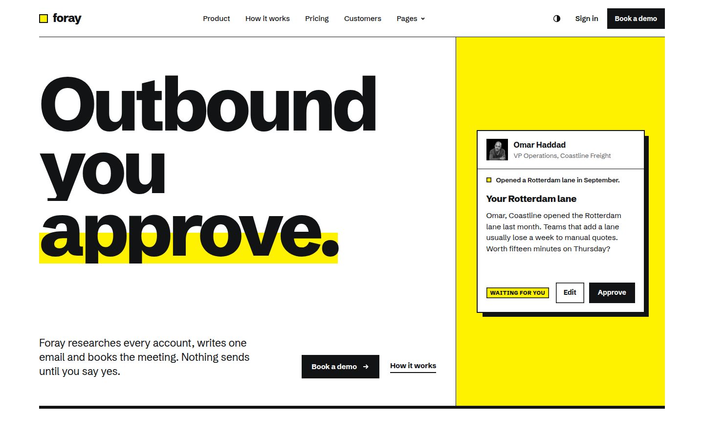
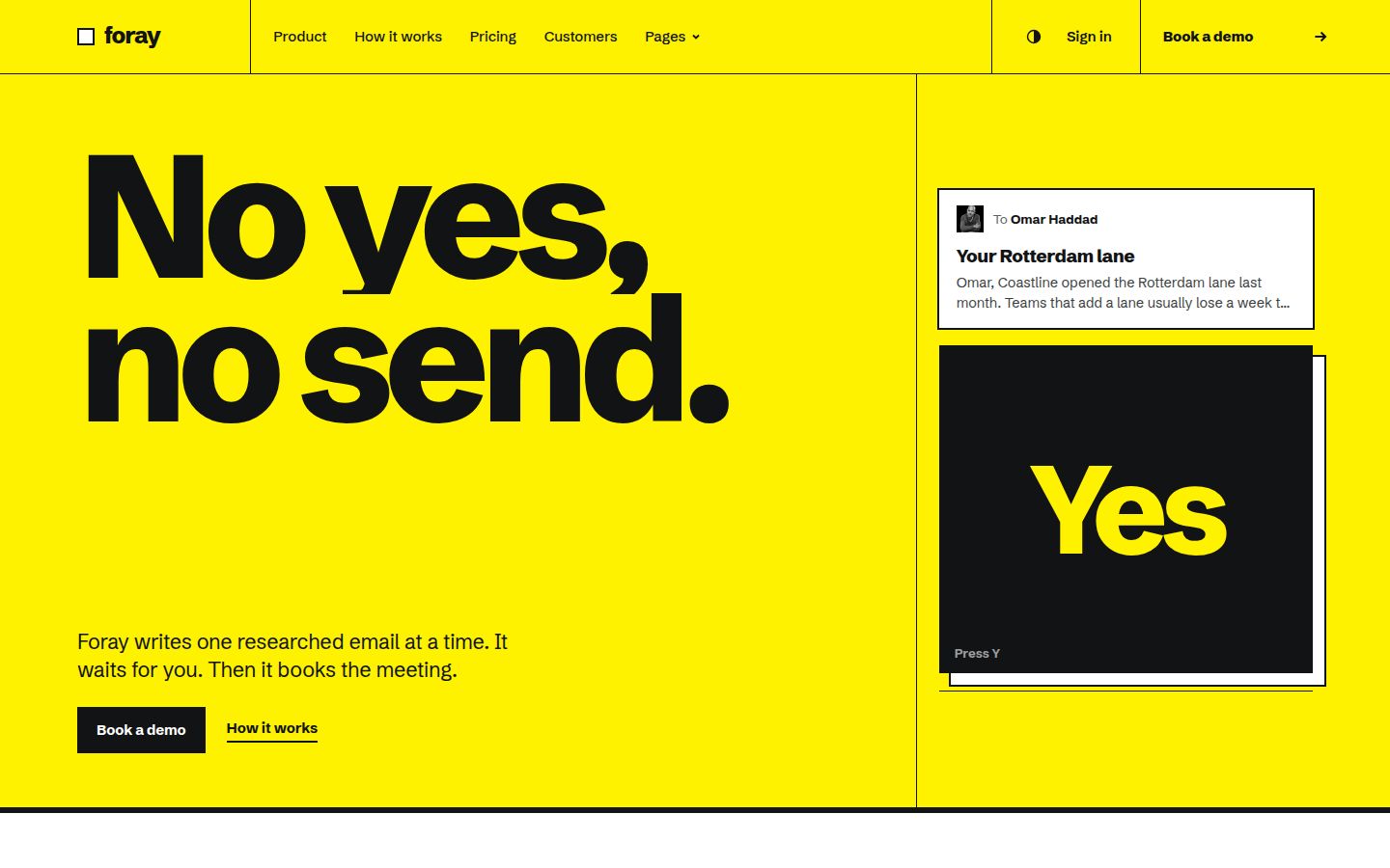
Its three home pages take three directions inside the same system: an approval desk where the agent drafts an email, it waits, and the visitor approves or edits it before it sends; an inset film card with a giant wordmark; and a yellow poster with a single yes key. The third is the most overtly Swiss: one colour, one message, very large type.
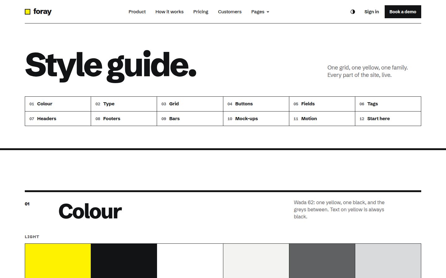
The palette is just yellow and black, and in dark mode the yellow becomes the focus and shadow colour, while inverted panels go deeper rather than white. That is the "limited colour" principle carried into a theme system. The style guide page sets out colour, type, grid and motion in one place, which is the page to read first if you plan to extend the system.
Foray ships as HTML today, with Framer, Webflow, Astro, WordPress and a prompt pack in production. It sits in the AI agent website templates collection alongside templates in other styles.
When Swiss style is the right call
Swiss style suits products that want to signal precision and control: developer tools, finance, data products, agents that act on someone's behalf. It suits teams that will add many pages over time, because a grid and a type scale make new pages consistent without a designer in the loop. It is a good fit for content-heavy sites too, since the system is built for organising information.
It is a weaker fit if your brand is warm and soft, or if your product's value is atmosphere rather than clarity. In that case a softer, layered look such as glassmorphism may suit better. If you like the rawness of exposed structure but want to push further, read our take on brutalist web design, where Swiss discipline is the closest well-behaved relative.
Before buying any template in any style, run through the complete template checklist and the accessibility checklist.
Changelog
- 2026-10-05: first published