What a developer tools website needs to win engineers
What a developer tools website needs: code in the first screen, an install line, a language toggle, docs and changelog in the nav, and dark mode.
A developer tools website has to pass a quick technical sniff test before anyone reads the copy. Put real code in the first screen, an install line they can copy, a language toggle if you support more than one, docs and the changelog in the main navigation, pricing that states the limits plainly, an honest integrations list and a dark mode that works. Code blocks must be real text, not images, so engineers can select, copy and search them.
Engineers evaluate tools differently from other buyers. They skim for proof that the thing exists and works the way they expect, they distrust adjectives, and they will open the docs in a new tab before they finish the hero. The site's job is to make that evaluation fast. Here is what that takes, with examples from our developer tools website templates.
Code in the first screen
The hero of a developer tool should show the tool being used. For an SDK or API, that means a short, realistic code sample. For a product with an interface, it means the interface doing something real. Either way, an engineer should understand what the tool does within a few seconds of landing, without scrolling.
What makes a hero code sample work:
- It is short enough to read at a glance, usually under fifteen lines.
- It does one real thing end to end: create a client, call one method, use the result.
- It uses realistic names, not foo and bar.
- It is syntax-highlighted with a palette that stays readable in light and dark themes.
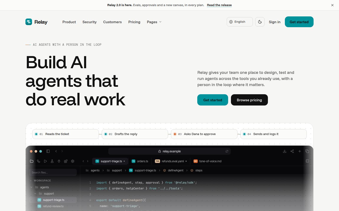
Relay, our template for an AI agent and workflow platform, shows the product the way developers expect on its home page: code samples, an install line with copy buttons and an example-run player.
The install line
The single most useful line on a developer tool's home page is the one they paste into a terminal. Put the install command near the hero, in a monospaced box, with a copy button. If you support several package managers, offer a small switcher rather than listing them all.
A copy button is a few lines of script. The important parts are copying the text content, not the HTML, and confirming that the copy worked:
document.querySelectorAll('[data-copy]').forEach((button) => {
  button.addEventListener('click', async () => {
    const code = document.querySelector(button.dataset.copy).textContent;
    await navigator.clipboard.writeText(code);
    button.textContent = 'Copied';
    setTimeout(() => { button.textContent = 'Copy'; }, 2000);
  });
});
Changing the button text, as above, gives a visible confirmation that is not only a colour flash. For screen reader users, also write a short message into a small aria-live region next to the button.
Language toggle
If your SDK ships in more than one language, let visitors pick theirs once and see every sample on the page update. Engineers who work in Python do not want to translate TypeScript in their heads, and a page with every sample in both languages doubles its length.
Relay has a TypeScript and Python toggle that updates every code sample on the page, with copy buttons on each. Two details make a toggle feel right: remember the choice as the visitor moves between pages, and keep the samples genuinely equivalent, so switching language does not quietly change what the code does.
Docs and changelog in the navigation
For developer products, docs are not a support resource. They are part of the sales process. Put Docs in the main navigation, not the footer, and make sure it goes somewhere useful, even if your full docs live on a separate site.
The changelog belongs next to it. A recent, specific changelog is the strongest signal that a tool is maintained, and engineers check it before they adopt anything. Each entry should say what changed, why it matters and whether anything breaks.
Foldline, our AI code review template, ships a changelog with an entry page, a roadmap with voting, and docs with an article page alongside its marketing pages. Relay and Halden also include a changelog page. If your docs live elsewhere, a docs landing page on the marketing site that points to the main sections still helps visitors orient themselves.
Pricing that states the limits
Developers read pricing for limits, not plan names. Requests per minute, runs per month, seats, retention, concurrency, what happens when you exceed a quota. State each one as a number in the plan cards or the comparison table, and say plainly whether overages are billed, throttled or blocked.
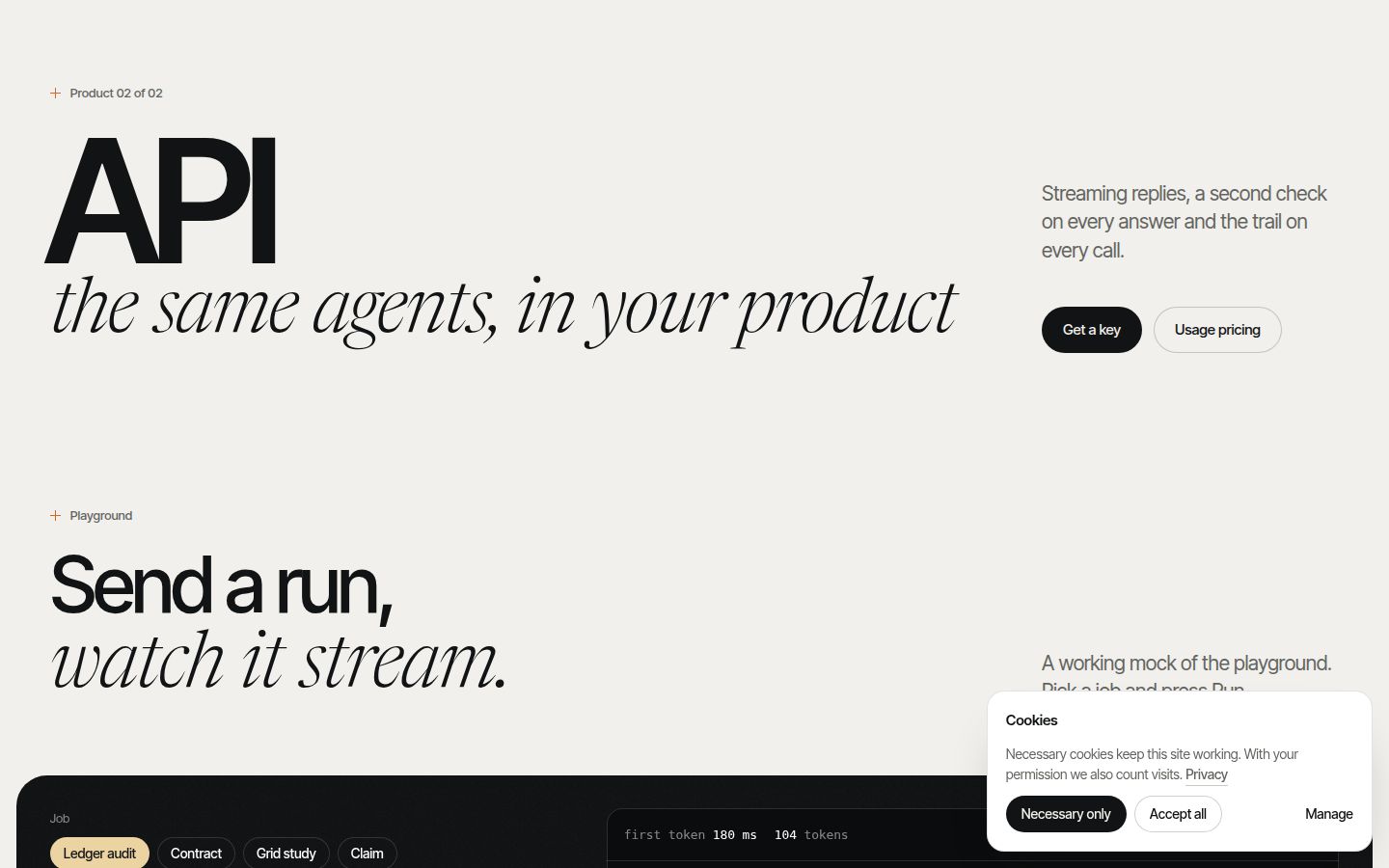
For usage-based products, add a calculator. Halden ships pricing with a usage calculator, and an API page with a streaming playground, which suits a product sold on consumption. Foldline includes pricing with a plan comparison. Our SaaS pricing page anatomy covers the full structure.
A free tier or a generous trial matters more for developer tools than most categories, because engineers want to try before they recommend. If you have one, say so next to the install line, not only on the pricing page.
Integrations, honestly listed
An integrations page answers "does it work with what I already use". Keep it honest: list what you support today, mark anything in beta, and give each integration a short page that says what it does, how to set it up and what permissions it needs. A grid of logos with no detail pages reads as aspirational.
Relay and Foldline both include an integrations index with a single-integration page, which is the structure to copy: an index for scanning and a detail page for the engineer who has to set it up.
Dark mode and real text code blocks
Engineers who spend the day in dark editors and terminals notice a site that flashes bright white. On a developer tool site, dark mode is close to expected. Do it with design tokens, not a separate stylesheet, so every component, code block and product mock-up switches together.
A common pattern is to set colour tokens on the root and override them for a dark theme attribute, following the system setting on first visit:
:root {
  --bg: #f7f5ef;
  --text: #191b17;
}

:root[data-theme="dark"] {
  --bg: #191b17;
  --text: #f7f5ef;
}

body {
  background: var(--bg);
  color: var(--text);
}
Foldline works this way: light and dark are two token sets, with dark mode styled as inked paper. Halden also ships light and dark modes. Our post on dark mode for marketing sites covers the details, including syntax highlighting in both themes.
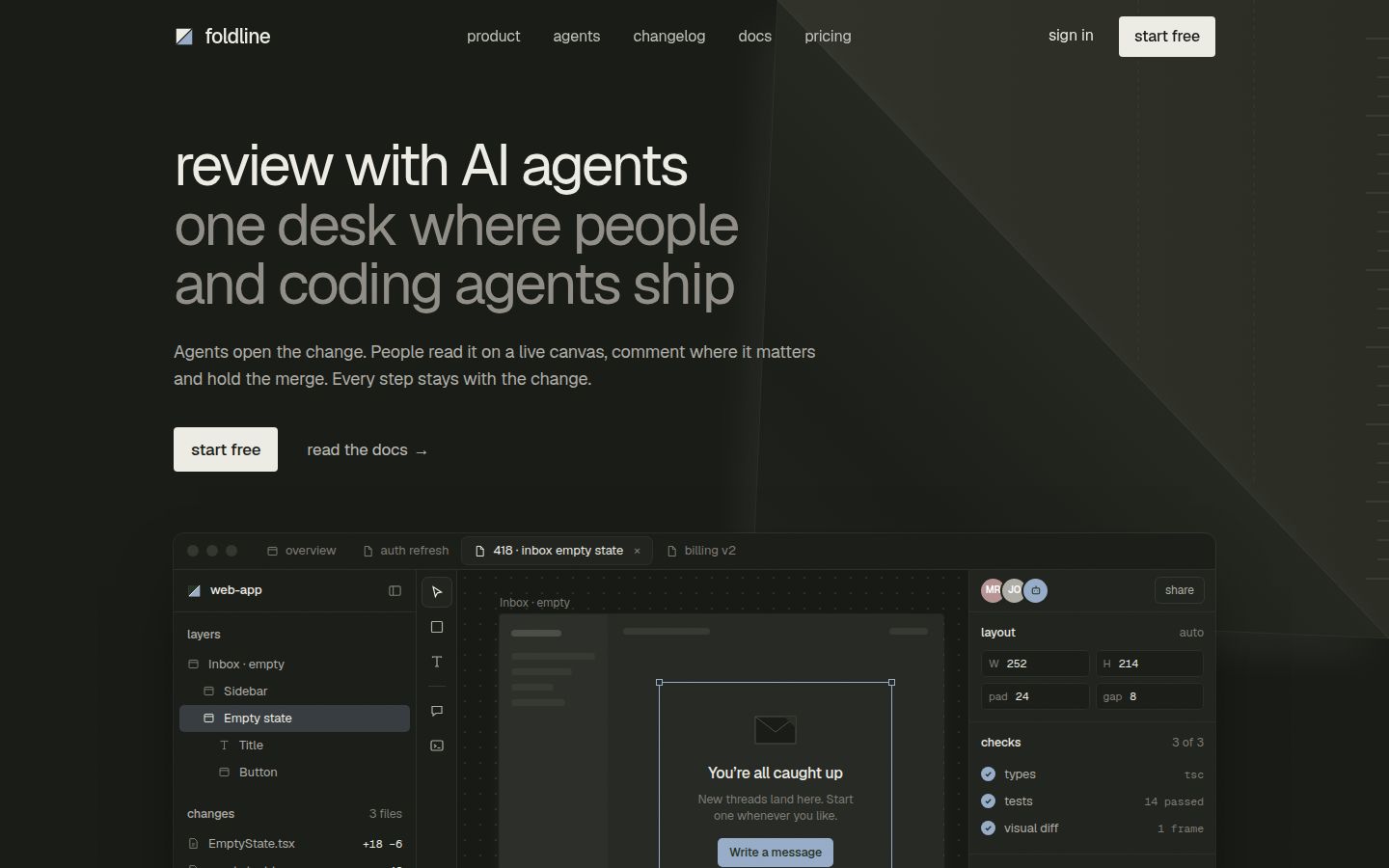
Code blocks themselves must be real text. Screenshots of code cannot be copied, searched, translated, read by screen readers or indexed by search engines, and they blur on high-density screens. The same goes for product windows: Foldline's live review window, with a prompt, a canvas edit, checks, an approval and a merge, is built as editable markup rather than a video or image.
The developer tools page list
A developer tools website needs at least:
| Page | Why engineers look for it |
|---|---|
| Home with code or product in the first screen | Proof the tool exists and how it feels |
| Install line with copy button | The first step, without hunting |
| Docs (or a docs landing page) | Whether they can actually use it |
| Changelog | Whether it is maintained |
| Pricing with explicit limits | Whether it fits their usage |
| Integrations index and detail pages | Whether it works with their stack |
| Security | What the tool can access, for whoever signs off |
| API reference or playground, if you have an API | How it behaves before writing code |
| Status or roadmap | What is coming and what is stable |
If you build sites in a coding agent, the Cursor and Claude Code collections are a good place to start, and our guide to editing a website template with Claude Code walks through the workflow.
Note: The companies, people and code in our template demos are fictional placeholders. Replace the code samples with your real SDK before launch.
Changelog
- 2026-10-05: first published